layout-card
Get more control over the placement of lovelace cards
For installation instructions see this guide.
Install layout-card.js as a module.
resources:
  - url: /local/layout-card.js
    type: module
Usage
type: custom:layout-card
layout: <layout>
min_height: <min_height>
min_columns: <min_columns>
max_columns: <max_columns>
column_width: <column_width>
max_width: <max_width>
min_width: <min_width>
flex_grow: <flex_grow>
justify_content: <justify_content>
ltr: <ltr>
cards:
    <cards>
Options
<cards>Required A list of lovelace cards to display.<layout>The layout method to use.auto,verticalorhorizontal. See below. Default:auto.<min_height>The minimum length of a column inautolayout.<min_columns>The minimum number of columns to use. Default:1.<max_columns>The maximum number of columns to use. Default:100.<column_width>Width of columns. Default:300px.<max_width>,<min_width>,<flex_grow>Set themax-width,min-widthandflex-growCSS properties of the columns manually. Default:column_width or 500px,undefined,undefined.<justify_content>Set thejustify-contentCSS property of the column container. Default:center.
Layouts
The basic concept of this card is that it takes a number of other cards, and places them in the browser window, just like lovelace does normally, but allowing you a bit more control.
Since layout-card is a card in it self its area of effect will be limited to the width of a card, and thus you will (almost) always want to use it in panel mode:
views:
  - title: My view
    panel: true
    cards:
      - type: custom:layout-card
        ...
auto layout
The auto layout works in the same way as the default lovelace layout.
It follows a simple process.
- A number of columns are prepared based on the screen width and
<column_widt>. - The number of columns is clamped between
<min_columns>and<max_columns> - Cards have a
cardHeight, which is calculated from their content. One unit is roughly 50 pixels tall. - Each new card is added to the first row which is less than
<min_height>units tall. - If all columns are taller than
<min_height>, the card is added to the shortes column. - Once all cards have been placed, any remaining empty columns are removed.
type: custom:layout-card
cards:
  - type: entities
    title: 1
    entities:
      - light.bed_light
  - type: entities
    title: 2
    entities:
      - light.bed_light
  - type: entities
    title: 3
    entities:
      - light.bed_light
  - type: entities
    title: 4
    entities:
      - light.bed_light
      - light.bed_light
      - light.bed_light
      - light.bed_light
  - type: entities
    title: 5
    entities:
      - light.bed_light
  - type: entities
    title: 6
    entities:
      - light.bed_light
  - type: entities
    title: 7
    entities:
      - light.bed_light
  - type: entities
    title: 8
    entities:
      - light.bed_light

Note: The same 8 cards will be used in the following examples and will be omitted for clarity.
horizontal layout
The horizontal layout calculates the number of columns just like the auto layout.
It then places the first card in the first column, the second card in the second columns, and so on. Once it reaches the last column, it starts over from the first.
type: custom:layout-card
layout: horizontal
cards:
  - ...

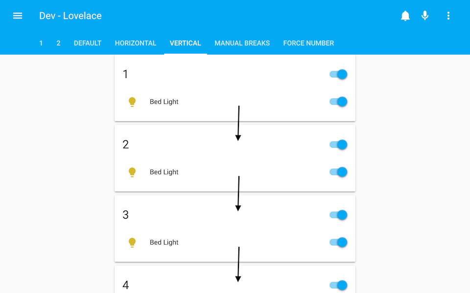
vertical layout
The vertical layout calculates the number of columns just like the auto layout.
It then places every card in the first column.
type: custom:layout-card
layout: vertical
cards:
  - ...
It's OK to think I'm out of my mind at this point. And if you don't, you probably will once I claim that this is probably the most useful layout.
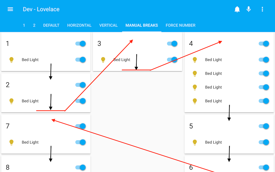
Still here? OK. Let me tell you about the break.
- break
Just add - break to the list of <cards> to make card placer move on to the next column for the next card.
This is most useful in the vertical layout, but will work in the horizontal and auto layouts too.
type: custom:layout-card
layout: vertical
cards:
  - type: entities
    title: 1
    ...
  - type: entities
    title: 2
    ...
  - break
  - type: entities
    title: 3
    ...
  - break
  - type: entities
    title: 4
    ...
  - type: entities
    title: 6
    ...
  - break
  - type: entities
    title: 7
    ...
Tweaking layouts
- First of all
<min_columns>and<max_columns>options, which can be used to force the number of columns displayed:
type: custom:layout-card
layout: vertical
min_columns: 7
cards:
  - ...

Note: See how squeezing cards too tight will make them look weird? Keep this in mind, and don't send me bug reports about it.
Your toggles would pop out too if someone forced you into a 100 pixel box.
- The width of columns can be specified either all together...:
type: custom:layout-card
column_width: 200
cards:
  - ...

- ...or as a list of column widths:
type: custom:layout-card
column_width: [200, 300, 150]
cards:
  - ...

If there are more column than values in the list, the last value in the list will be used for the remaining columns.
- Values can be specified either in pixels or in percentages:
type: custom:layout-card
column_width: 30%
cards:
  - ...

-
Further tweaks can be made in the same way using
<max_width>and<min_width>, but most of the time<column_width>should be enough. -
<flex_grow>(single value or list) and<justify_content>(single value) can be used to tweak the CSS flexbox settings of the layout. See this excelent guide for more info. -
<rtl>will make the columns display from right to left instead of left to right.
A few tips
-
Layout-cards can be placed inside other layout-cards or in vertical-stack cards:

-
gap-card can be used to leave a gap in the layout:

-
The card list can be populated automatically using auto-entities
type: custom:auto-entities
filter:
  include:
    - domain: light
      options:
        type: light # Make sure to specify a card type for every filter
    - domain: climate
      options:
        type: thermostat
  exclude:
    - state: unavailable
sort:
  method: name
  ignore_case: true
card:
  type: custom:layout-card