layout-card
Get more control over the placement of lovelace cards
Installation instructions
This card requires card-tools to be installed.
For installation instructions see this guide.
The recommended type of this plugin is: js
If you are using custom_updater:
resources:
- url: /customcards/github/thomasloven/card-tools.js?track=true
  type: js
- url: /customcards/github/thomasloven/layout-card.js?track=true
  type: js
Usage instructions
This card takes other cards and place them in different layouts.
This card works best if used in panel mode.
Each layout consists of columns, the number of which is determined by your screen width and the settings of layout-card.
There are three different layouts:
auto
This layout works the same way as the default lovelace layout. Cards are automatically added to stacks depending on their height. That may seem pointless, but trust me, this has it's uses.

  - title: Default
    panel: true
    cards:
      - type: custom:layout-card
        cards:
          - type: entities
            title: 1
            entities:
              - light.bed_light
          - type: entities
            title: 2
            entities:
              - light.bed_light
          - type: entities
            title: 3
            entities:
              - light.bed_light
          - type: entities
            title: 4
            entities:
              - light.bed_light
              - light.bed_light
              - light.bed_light
              - light.bed_light
          - type: entities
            title: 5
            entities:
              - light.bed_light
          - type: entities
            title: 6
            entities:
              - light.bed_light
          - type: entities
            title: 7
            entities:
              - light.bed_light
          - type: entities
            title: 8
            entities:
              - light.bed_light
horizontal
This layout will place cards in one column at a time, and then move on to the next - horizontally.

  - title: Horizontal
    panel: true
    cards:
      - type: custom:layout-card
        layout: horizontal
        cards:
          - type: entities
vertical
This layout will place cards vertically in one column
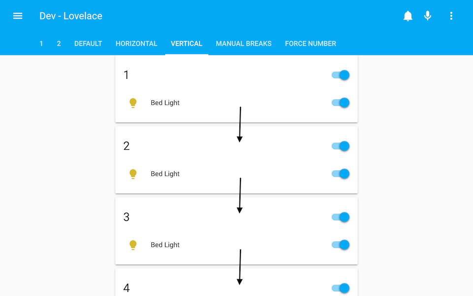
  - title: Vertical
    panel: true
    cards:
      - type: custom:layout-card
        layout: vertical
        cards:
          - type: entities
It's OK to think I'm out of my mind at this point, but hang on; let me introduce the break.
Add a - break to the list of cards to break the column right there, and move on to the next one.
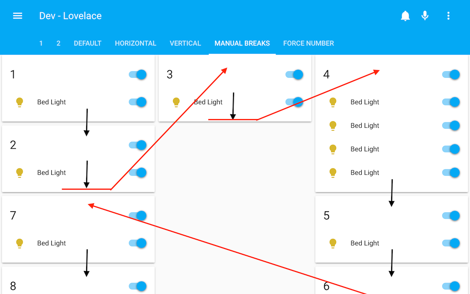
  - title: Manual breaks
    panel: true
    cards:
      - type: custom:layout-card
        layout: vertical
        cards:
          - type: entities
            title: 1
            ...
          - type: entities
            title: 2
            ...
          - break
          - type: entities
            title: 3
            ...
          - break
          - type: entities
            title: 4
            ...
          - type: entities
            title: 5
            ...
          - type: entities
            title: 6
            ...
          - break
          - type: entities
            title: 7
            ...
          - type: entities
            title: 8
            ...
Breaks also work with the horizontal layout, and even auto. Experiment a bit.
Configuration
title: My view
panel: true
cards:
  - type: custom:layout-card
    layout: <layout>
    column_num: <column count>
    max_columns: <max column count>
    column_width: <column width>
    max_width: <max column width>
    min_height: <min height>
    cards:
      <cards>
<layout>
Optional. Default: auto
Either auto, vertical or horizontal.
<column count>
Optional. Default: 1
The minimum number of columns to make. Note that if a column has no cards, it will be removed regardless.
<max column count>
Optional. Default: 100
The maximum number of columns to make.
<column width>
Optional. Default: 300
The minimum width of a column in pixels.
<column width> can also be an array of values ending with % or px. In that case the values will specify the width of each column and <column count> will be overridden with the number of entries in the array.
Ex: column_width: [70%, 300px, 30%] will result in three columns, where the center one is 300 pixels wide, and the left and right divide the remaining space in a 70/30 ratio.

This allows for some really interesting layout options when combined with stacks. Play around!

<max column width>
Optional. Default: 500
The maximum width of a column in pixels.
This value is ignored if <column width> is an array.
<min height>
Optional. Default: 5
The number of units needed before a column is considered not empty.
<cards>
Required.
A list of cards to put in the layout.
The list can also contain - break - see description of layouts above.
FAX
Can I leave a gap in the layout?
Yes. By using the compainon card: gap-card.