4.3 KiB
card-mod
Allows you to add css styles to any lovelace card.
For installation instructions see this guide.
Install card-mod.js as a module.
Usage
This is not a new card. Instead it changes the way pretty much any other card works.
Specifically, it looks for style: in any cards configuration, and applies the CSS specified there to the card.
The basis of all lovelace cards there's a ha-card element, so that's probably where you'd want to start.
Example:
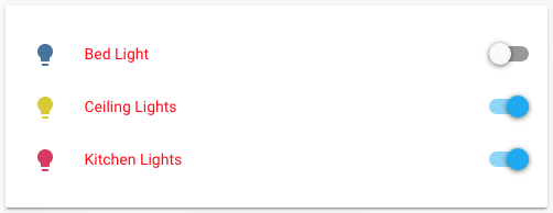
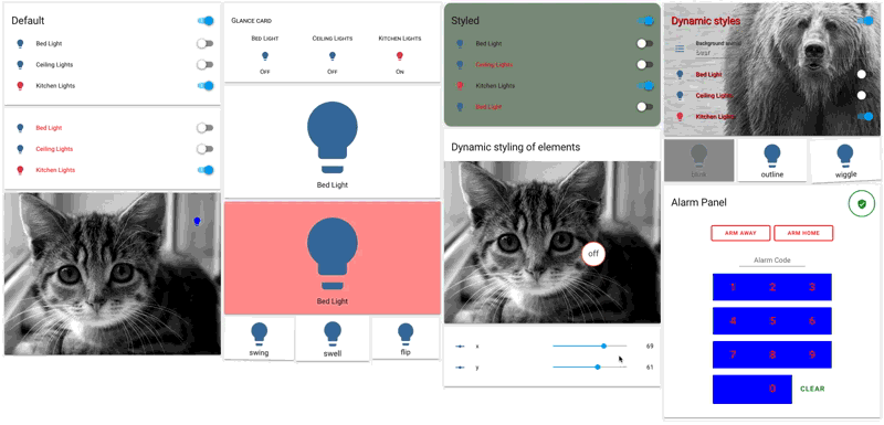
Change the text color of an entities card to red.
type: entities
style: |
  ha-card {
    color: red;
  }
entities:
  - light.bed_light
  - light.ceiling_lights
  - light.kitchen_lights
By using the element inspector of your browser (chrome, firefox, safari, explorer) you can find out how cards are built up and what styles they are using.
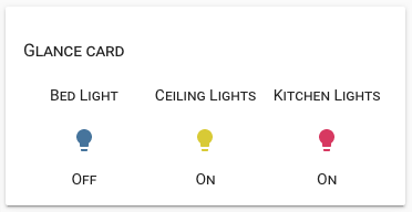
Example
Make a glance card use smallcaps and change the font size of the title
type: entities
style: |
  ha-card {
    font-variant: small-caps;
  }
  .card-header {
    font-size: 16px;
  }
entities:
  - light.bed_light
  - light.ceiling_lights
  - light.kitchen_lights
You can also use templates to change the styles dynamically.
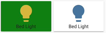
Example
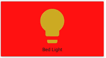
Make an entity-button card green when the light is on
type: entity-button
entity: light.bed_light
style: |
  ha-card {
    background: [[ if(light.bed_light == "on", "green", "") ]];
  }
Anything you add in style: will be put in a <style> tag, so you can also use things like css keyframes
Example
Make a blinking button
type: entity-button
entity: light.bed_light
style: |
  @keyframes blink {
    50% {
      background: red;
    }
  }
  ha-card {
    animation: blink 2s linear infinite;
  }
More examples
More examples are available here.
Advanced usage
When exploring the cards using the element inspector, you might run into something called a shadow-root and notice that you can't apply styles to anything inside that.
In this case, you can make style: a dictionary instead of a string, where each key is a querySelector string and it's value styles to apply to it - recursively. A key of $ means go into a shadow-root and a key of . the current element.
This is not for the faint of heart.
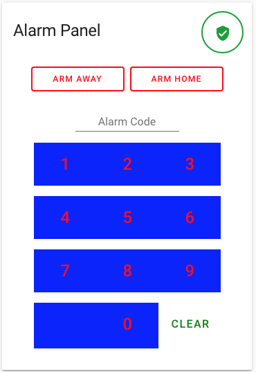
Example:
Change some things in an alarm-panel card.
type: alarm-panel
card_icon: mdi:bell
name: Alarm Panel
style:
  .: |
    ha-card {
      --mdc-theme-primary: red;
    }
  "#keypad mwc-button":
    $: |
      :host {
        background: blue;
      }
      button {
        font-size: 24px !important;
      }
  "#keypad mwc-button:nth-of-type(12)":
    $: |
      button {
        font-size: 16px !important;
        --mdc-theme-primary: green;
      }
entity: alarm_control_panel.alarm